What is an A-3 Report?

REFLECTION: FOR STUDENTS: “Having no problems is the biggest problem of all.”- Taiichi Ohno
FOR ACADEMICS: “Data is of course important in manufacturing, but I place the greatest emphasis on facts.”- Taiichi Ohno
FOR PROFESSIONALS/PRACTITIONERS: “Make your workplace into showcase that can be understood by everyone at a glance.”- Taiichi Ohno
Foundation
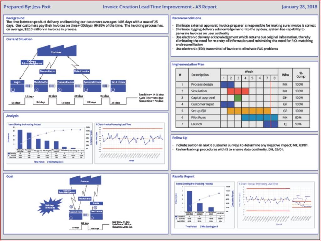
The A3 Report is a model developed and used by Toyota and currently used by many businesses around the world. The A3 Report is named for a paper size-A3 (29.7 x 42.0cm, 11.69 x 16.53 inches). The entire current state and PDCA aspects of the project are captured visually for easy communication and reference. When CIP projects use an A3 methodology to track projects, it has been demonstrated that clear visual communication helps the team members and the overall organization be more aware of the team’s progress.
A minor improvement event, in my experience, is generally four weeks to six weeks. Still, when an issue needs to be addressed thoroughly, the organization must be willing to invest more time and resources. Almost every moment of improvement time spent may be wasted if the true root cause is not adequately addressed due to failure to properly invest resources. There are four distinct phases: 1) preparation and training; 2) process mapping and current state analysis; 3) process mapping and future state analysis; and 4) implementation and ownership. I will put up a basic template below and walk through the A3 report.
Example

- Clarify the Problem
- IS/IS Not Analysis-excellent first tool to use to define the scope of the problem.
- After the scope of the problem has been defined, define the problem relative to the organization or process. The focus should always be on an underlying process or systematic issue, not an individual failure. Systematic failures are frequent but can be corrected with teamwork. The problem statement should never include a suggestion for a solution.
- Breakdown the Problem
- Clearly define the problem in terms of the 5 Why’s and 2 W’s (Who?, What?, When?, Where?, Why? And How?, How much or often?
- Set goals for improvement towards the ideal state vs current state
- Team sets S.M.A.R.T. goals relevant to block 1 state, establishing the end improvement target
- Root Cause Analysis
- Team uses focus areas from block 2 to determine Root Cause(s) employing relevant RCA tools
- Common RCA tools
- Cause-Effect/Fishbone Diagram
- 5 Why Analysis
- Fault Tree Analysis
- Pareto Chart
- Clearly state the determined root cause(s) and display the output of the tools
- Develop Countermeasures
- The team should take the root cause/causes from Block 4 and assign specific countermeasures.
- Countermeasures should directly address the root cause and, in theory, should solve the problem identified in Block 1.
- The completed fifth block is populated with any tool that will outline the countermeasures.
- Implement Countermeasures
- The team tracks the countermeasures from Block 5 and ensures each one is accomplished.
- The completed sixth block should be populated with the tool used in Block 5 to outline the countermeasures and updated as each is accomplished.
- Monitor Results and Process
- Effectiveness Check of Countermeasures
- Before/After Analysis
- SPC Control Charts
- Use Data from block 1 to determine if countermeasures from block 5 are having the desired effect relative to the target.
- If countermeasures are not effective, go back to RCA-block 4 (PDCA) and reconvene.
- Use the tool from block 6 to track countermeasure as ineffective in Block 7
- Effectiveness Check of Countermeasures
- Standardize successful processes
- If countermeasures are effective-
- Standardize all successful processes and note successful countermeasures as Standardized as they are approved using the tool from block 6 in Block 7
- A separate block can be used for Standardized processes
- If countermeasures are effective-
Conclusion
A complete A3 report can use many different tools, depending upon the problem being examined, so don’t fall into the habit of always using the exact same format. Be certain all four phases are completed. Innovation comes from creativity, so leave behind SOPs that demand exact clones of past reports. You may be dealing with a problem no person in your organization has yet to encounter, so outside of the box is thinking should always be on the table (Not locked away in a closed mind)

Processing…
Success! You're on the list.
Whoops! There was an error and we couldn't process your subscription. Please reload the page and try again.


Bibliography
Quality Management Journal, Volume 16, 2009 – Issue 4
Published Online: 21 Nov 2017
Quality Progress Volume 49, 2009 – Issue 1
Jan 2016
Basic QA Statistics Series(Part 5)- Basic Histogram

REFLECTION: FOR STUDENTS: When that graph pops up showing you data in histogram, pay closer attention to everything the graph is conveying, because effective conveyance of data is the future
FOR ACADEMICS: Teach your students how to use visual data graphics, and correct them when they slip up. From teachers to the boardroom, being able to construct a histogram for a presentation is a vital skill for information conveyance.
FOR PROFESSIONALS/PRACTITIONERS: Excel and Minitab do the job, but always remember the underlying theory behind the graphs for when the software goes down, or you need to do it quickly without a computer.
Foundation
As Promised from the last post from this series, we will now delve a little bit into histograms. The primary purpose of a histogram is to provide a straightforward graphic representation of the distribution of data. I’m sure everyone has heard the term “a picture speaks a thousand words.” To demonstrate this, I will show you three histograms and think you will see before you read any caption which histogram looks like useful data. Sample data should appear pretty much like a bell curve to be declared “normal.”

When the “Tail” is to the left the data is left skewed- and look at that clear outlier bin

A histogram with an almost perfectly normal distribution

When the “Tail” is to the left the data is right skewed
The histogram is a quick communication of the state of the data. When you see the strong left or right skew, you must investigate the outliers and determine why you have so many.
Constructing a Histogram from your Data
To construct a histogram from a continuous variable, you need to determine the amount of data to be used. If you were researching problems with a production line, Cost would be your horizontal, split into bins, with the recommended number of bins equal to √n (n being the number of samples), and the bins having set boundaries. Fifty data points should be your minimum. Each bin will separate the data into classes based upon frequency, but the histogram will not show you the raw data, only represent the frequency distribution. I would suggest familiarizing yourself with your company’s statistical software so that everyone uniformly performs the analysis. Having the statistical guidelines per the software will save you in some auditing situations. Minitab, Excel, and many others provide straightforward access to histogram construction. (Kubiak, 2017) Most software equalize the width of the bars, but the way I have seen the width determined by hand most often is:
- Determine # of Bars to use based upon the sample size
- Sample size of 100 or less: 7-10 Bars
- Sample size of 100-200: 11-15 Bars
- Sample size of 201 or more: 13-20 Bars
- Choose # of Bars to use
- Width(W) = Overall Range of Data (R) / # of Bars(B)
- W=R/B.
- Keep adding W to the previous bar to find the lower edge of the next bar, starting from 0
(Tague, 2005)
Conclusion
Histograms are kind of like a way to count your data frequency of occurrence within set boundaries, and then show graphically how your data is distributed. Always remember that if a histogram is constructed with too many or too few bins, it can be manipulated misleadingly. Always check the numbers yourself! This tool is one of the Seven Basic Quality Tools and meant to be used to help flag issues like outliers or non-normal data. It is not something that can solve a problem on its own, but a tool that enables you to understand what the data is telling you. The next post we cover will talk about another visual stat tool- the box and whisker diagram (for any cat lovers 😊).
Processing…
Success! You're on the list.
Whoops! There was an error and we couldn't process your subscription. Please reload the page and try again.
Create Amazon Business Account
Bibliography
Kubiak, T. a. (2017). The Certified Six Sigma Black Belt Handbook Third Edition. Milwaukee: ASQ Quality Press.
Tague, N. R. (2005). The Quality Tool Box. Milwaukee: Quality Press.
Basic QA Statistics Series(Part 2)- Basic Measures of Central Tendency and Measurement Scales

REFLECTION: FOR STUDENTS: Learning is not compulsory… neither is survival. – W. Edwards Deming
FOR ACADEMICS: Our schools must preserve and nurture the yearning for learning that everyone is born with. -W Edwards Deming
FOR PROFESSIONALS/PRACTITIONERS: Data are not taken for museum purposes; they are taken as a basis for doing something. If nothing is to be done with the data, then there is no use in collecting any. The ultimate purpose of taking data is to provide a basis for action or a recommendation for action. The step intermediate between the collection of data and the action is prediction. -W. Edwards Deming
Foundation
The previous post covered just the definition of Population and Sample and the descriptions of each using Parameters for Population and Statistics for a Sample. We also mentioned data. To be able to communicate about data, we first have to define data. Define should always be the first step for better understanding.
Data are characteristics or information (usually numerical) that are collected through observation. In a more technical sense, data consists of a set of values of qualitative or quantitative variables concerning one or more persons or objects.
The two broadest categories of Data are: Qualitative and Quantitative-
Qualitative data deals with characteristics and descriptors that cannot be easily measured but can be observed in terms of the attributes, properties, and of course, qualities of an object (such as color and shape). Quantitative data are data that can be measured, verified, and manipulated. Numerical data such as length and weight of objects are all Quantitative.
On the next level of Data are Discrete and Continuous Data.
Discrete Data– Pyzdek and Keller defined discrete data as such: “Data are said to be discrete when they take on only a finite number of points that can be represented by the non-negative integers” (Kubiak, 2017). Discrete data is count data and sometimes called categorical or attribute data. A count cannot be made more precise. You cannot have 2.2 fully functional cars.
Continuous Data– Pyzdek and Keller state- “ Data are said to be Continuous when they exist on an interval, or on several intervals.” Another term used is Variable data. Height, weight, and temperature are continuous data because between any two values on the measurement scale, there is an infinite number of other values (Kubiak, 2017).
Measurement Scales
- Nominal
- Classifies data into categories with no order implied
- Ordinal
- Refers to data positions within a set, where the order is essential, but precise differences between the values are not explicitly defined (example: poor, ok, excellent).
- Interval
- An Interval scale has meaningful differences but no absolute zero. (Ex: Temperature, excluding the Kelvin scale)
- Ratio
- Ratio scales have meaningful differences and an absolute zero. (Ex: Length, weight and age)
(Kubiak, 2017)
I know that it seems like a lot to digest, but recording data correctly is critical. Next, we will discuss the Central Limit Theorem: Per the central limit theorem, the mean of a sample of data will be closer to the mean of the overall population in question, as the sample size increases, notwithstanding the actual distribution of the data. In other words, the true form of the distribution does not have to be normally distributed (a bell curve) as long as the sample size is sufficiently large(Kubiak, 2017). There will eventually be a separate post(s) on sampling, distribution, and choosing the ideal sample size, but we are starting at the basics.

Note: Ordinal Data can be confusing. It depends on the how the ordinal scale is arranged. The Likert Scale would be considered quantitative ordinal, while the Movie rating scale would be considered qualitative ordinal.
(Kubiak, 2017)
Measures of Central Tendency
Three Common ways for quantifying the centrality of a population or sample include the
- Mean
- Arithmetic Average of a data set. This is the sum of the values divided by the number of individual values Ex: [1,3,5,10] Average is 4.75
- Median
- This is the middle value of an ordered data set. When the data are made up of an odd number of values, the median value is the central value of the ordered set. [1, 3, 5], so 3 is the median. When there is an even number of data points, the median is the average of the two middle values of the ordered set [1, 3, 5, 10]. In this case, the Median is the average of 3 and 5: (3+5)/2=4
- Mode
- The mode is the most frequently found value in a data set. It is possible for there to be more than one mode. EX: [1,2,3,5,1,6,8,1,8,1,3]- The Mode is 1
(Kubiak, 2017)
Conclusion
Correctly recording Data and using the proper scale to track your Data is the first step to understanding your process outputs.
A next baby step is knowing how to measure your process based upon your data scale. Being able to calculate the Measures of Central Tendency helps you, but Stats software will do much of this for you. Still, you need to know what you are seeing. It is always most helpful to know what those stat software programs are doing with your data so you can more robustly defend your decisions. Next time we will go a little deeper and talk about Measures of Dispersion (and it is precisely what it sounds like!).
Processing…
Success! You're on the list.
Whoops! There was an error and we couldn't process your subscription. Please reload the page and try again.
Create Amazon Business Account
Bibliography
Kubiak, T. a. (2017). The Certified Six Sigma Black Belt Handbook Third Edition. Milwaukee: ASQ Quality Press.
Intro to Basic QA Statistics Series (Part 1)

REFLECTION: FOR STUDENTS: Don’t throw your stat’s books away. You will use them one day, and unlike most other textbooks, old statistics textbooks are usually just as valid as they were years ago.
FOR ACADEMICS: Yes, teach your students to use R and Minitab, but be sure they can do the calculations by hand
FOR PROFESSIONALS/PRACTITIONERS: I know you likely are old hands at this, but thank you for any advice you can provide those entering the QA field who have questions. Stats sometimes seems mystifying, so be sure to share the knowledge with mentorship.
Foundation
Most in the industrial world understand that tracking and analysis of data is a requirement to know if a process is producing waste or if your process is stable and everything is running as it should. The problem that arises from time to time is the “craftsman attitude” of a process owner, or perhaps even that same attitude in a plant manager.
What I am describing with the term -“craftsman attitude”- is the acquired belief of a knowledgeable Subject Matter Expert or Expert Operator, which leads a person to decide of their own accord they are wise enough to make a critical decision without proper Data Analysis.
At this point in any conversation with a person trying to argue they do not need Data, I would quote Deming- “In God we trust, all others must bring DATA.”
This phenomenon is likely a combination of two primary things:
Resistance to Change and a natural aversion (at least in Western Society) to developing a deep understanding of mathematics. Resistance to Change is inherent in many human beings and very hard to overcome. Awareness of the potential Resistance and how it may influence your decisions can help mitigate how you react to Quality Improvement issues.
Mathematics is something you must pursue on your own unless you were gifted with a natural aptitude (as the school systems are not very effective when it comes to producing mathematically educated high school graduates). Fear not.
Lack of mathematical prowess means very little in this day and age. You need only understand the basic concepts of statistics and how to apply them, and most stats software will walk you through the rest.
This post will be the first of a few on basic stats to help those who may feel like it is beyond them to help show that it is not that complicated.
I will be keeping the stats on a basic level, and breaking the posts up into digestible bits, so please continue reading 😊
Basic Statistical Terms
The first terms that should be understood first are Population, Sample, Statistic, and Parameter.
-A Population considers every member/unit of a group
-A Sample would be a random surveillance study of a portion of the Population
-A Parameter is Derived from Analysis of the Population
-A Statistic is Derived from Analysis of the Sample of the Population

Conclusion
A Parameter is a description of an entire group (Population). A Statistic is the description of a sample of the Population. Understanding the difference is critical. A Parameter indicates that the whole population has been evaluated in some way to obtain the result.
A Statistic depends upon randomness and sample size to adequately estimate the outcome of the population parameter.
The larger the random sample, the better!
If you have the time and resources, always choose a larger sample size!
-Next Time: Basic Measures of Central Tendency
Processing…
Success! You're on the list.
Whoops! There was an error and we couldn't process your subscription. Please reload the page and try again.

8D vs PDCA & DMAIC
REFLECTION: FOR STUDENTS: Are you using critical thinking or using a paint by the numbers method to solve problems?
FOR ACADEMICS: Are you providing your students with the tools needed to distinguish between “guidelines” and mandates?
FOR PROFESSIONALS/PRACTITIONERS: Is your organization allowing you find the true root cause of an issue or forcing you to fill out a form within a certain time frame? Try to convince top management to allow teams to properly explore root causes, and if management continues to violate standards by ignoring the concept of due diligence in favor of meeting the closure rate when more time should have been allotted- file a CAPA. It is your duty as a Quality Professional.
What is 8D?
I have been performing CAPAs for many years. I have employed many methods: The Tried and True PDCA, the DMAIC approach, and even utilized the A3 path when the visual display of ongoing CAPAs was critical to communication (or mandated by policy). The Eight Discipline (8D) Approach has been the path that was least used by me, as it was (to me) least flexible. For those who are proponents, it works fine, but it seems more about CAPA closure by the numbers and documentation than it is about teaching your team to be independent critical problem solvers. While 8D will work well in any industry if implemented correctly, 8D is more template-based than PDCA. Have no doubt, DMAIC is quickly becoming template-like via software applications. A basic template is a useful guide, but the less controlled the problem solving, the more likely the team is to arrive at an innovative solution.
For those who are unsure what the Eight Disciplines are, let me elaborate on the Eight Disciplines:
Originally Ford developed the 8D method in the late 80s, and it spread to most of the automotive industry.
The Ds in this method are not acronyms (as many seem to struggle with), but rather a set of “Disciplines” to follow for problem-solving. These Disciplines were widely transferred to “forms” that became “8D Forms”, used for root cause analysis and correction of problems with unknown causes.
8D Method
- D0- Plan for solving the problem and determine resources needed
- Before 8D analysis begins, proper planning will always translate to a better start.
- SME Input
- Collect data on issues
- Identify any need for an Emergency Response Action (ERA)
- D1-Use a Team
- Choose the right type of team, right team members
- Teams require proper preparation.
- Set the ground rules
- 8D must always have two key members: a Leader and a Champion / Sponsor
- D2- Define and Describe the problem
- Specify by identifying in quantifiable terms the who, what, where, when, why, how, and how many (5W2H)
- 5 Why or Repeated Why (Inductive tool)
- Problem Statement
- Affinity Diagram (Deductive tool)
- Fishbone/Ishikawa Diagram (Deductive tool)
- Is / Is Not (Inductive tool)
- Problem Description
- D3- Develop interim containment plan
- Implement Interim Containment Actions (ICA)
- Verification of effectiveness of the ICA is always recommended to prevent any escapes to customers
- D4- Determine, identify, and verify root causes and escape points
- Comparative Analysis listing differences and changes between “Is” and “Is Not”
- Development of Root Cause Theories based on remaining items
- 5 Whys
- C&E Diagrams
- Determine Escape Point, which is the closest point in the process where the root cause could have been found but was not
- Review Process Flow Diagram for location of the root cause
- D5- Choose Permanent Corrective Action (PCA)
- Establish the Acceptance Criteria which include Mandatory Requirements and Wants
- Perform a Risk Assessment / Failure Mode and Effects Analysis (FMEA) on the PCA choices
- Based on risk assessment, make a balanced choice for PCA
- Select control-point improvement for the Escape Point
- Verify the PCA will resolve root cause of problem and any escape points issues
- D6- Implement and Validate PCAs for problem/nonconformity
- Define and Implement the best PCAs
- Validate PCAs using objective measurement
- D7- Prevent recurrence
- Review Similar Products and Processes for problem prevention
- Develop / Update Procedures and Work Instructions for Systems Prevention
- Capture Standard Work / Practice and reuse
- Assure FMEA updates have been completed
- Assure Control Plans have been updated
- Preserve and share the knowledge, preventing problems on similar products, processes, locations or families
- D8- Congratulate your team
- Archive the 8D Documents for future reference
- Document Lessons Learned on how to make problem-solving better
- Before and After Comparison of issue
- Celebrate Successful Completion
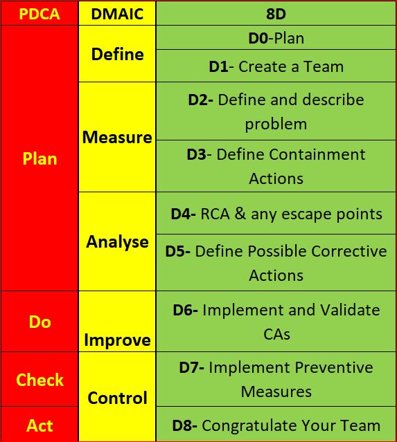
If you have interacted with a Six Sigma Team or a PDCA Root cause team, you know how the DMAIC and PDCA compares. For illustration, I have them side by side. 8D is much more broken down than the others. Using PDCA, the assumption is that a team acting in a PDCA cycle will have top management support and that those involved have the proper knowledge and training required to gather and analyze data to determine a solution. Also assumed is that the resources are available to improve the issue, Measurement of the results is always part of the cycle, and reacting to the final results of the Check on the improvement will yield either a successful CA/Improvement or begin a repeat of the cycle (basically the scientific method).
Most consider DMAIC the same as PDCA, just more focused on clarifying the PDCA cycle in order to reduce iterations by shifting the focus away from potential multiple cycles to achieving the most effective improvement the first time (though failure is still built into the process). The 8D method is once again pretty much the same process, as you can see.
When DMAIC and 8D are highly templated, a lot of the focus moves from solving the root cause toward closing the CAPA within the mandated time.
Making problem-solving quick and easy makes it easy to pencil whip. I would suggest you avoid the potential pencil whip methods. Have a group that must think for themselves and writes the report using only basic guidelines (not templates).
Conclusion
While I have clearly indicated I am not a fan of 8D and not happy with the way DMAIC is being pushed into templates, I do not mean to say that any single technique is better than another. Essentially, they are all the same method, re-focused. 8D is very conducive to utilizing documentation of project results and assigning work breakdown structure accountabilities (WBS) DMAIC is better for cross-functional communication and can be used for similar documentation. The Shewhart PDCA cycle is more of a high-level outline that allows the improvement project to be adjusted as required by SMEs. Choose the method that suits your needs, and as long as a cross-functional team performs proper due diligence with full top management support, the outcome will usually be similar regardless of the method chosen.
Processing…
Success! You're on the list.
Whoops! There was an error and we couldn't process your subscription. Please reload the page and try again.
Bibliography
ASQ. (nd). ASQ Quality Resources. Retrieved from WHAT ARE THE EIGHT DISCIPLINES (8D): WHAT ARE THE EIGHT DISCIPLINES (8D)?
Pruitt, W. F. (2019, May). A Disciplined Approach. Retrieved from ASQ Quality Progress: http://asq.org/quality-progress/2019/05/back-to-basics/a-disciplined-approach.html
Quality One. (nd). Quality One. Retrieved from Eight Disciplines of Problem Solving (8D): https://quality-one.com/8d/

The 7 New Quality Tools

The Seven New Management and Planning Tools
If you have had any formal training in Root Cause Analysis, Problem-solving, or any type of Quality Improvement, then the seven basic QC tools have most likely been taught to you rigorously (See Blog Post https://qualityconcepts.home.blog/category/7-basic-quality-tools/). While the seven tools are sufficient for problem-solving, they are not ideal for management and planning. The need for an expanded toolset was noticed and addressed in 1976 by the JUSE (Union of Japanese Scientists and Engineers) to promote innovation, communicate information, and successfully plan major projects. A JUSE team presented 7 New Quality tools (sometimes called the Seven Management and Planning -MP- tools): Affinity Diagram, Relations Diagram, Tree Diagram, Matrix Diagram, Matrix Data Analysis, Arrow Diagram, and Process Decision Program Chart (PDPC). Often in the modern world, the more complex Matrix Data Analysis is replaced with the similar Prioritization Matrix, so I will cover the Prioritization Matrix rather than the less commonly utilized Matrix Data Analysis tool.
The New Tools were exported to the United States in the mid-1980s and have become standard project management tools in the U.S. and internationally. Not all of these tools were new by any means, but the way they were presented was effective (Tague, 2005).
New Tools:
Affinity Diagram
Relations Diagram
Tree Diagram
Matrix Diagram
Prioritization Matrix
Arrow Diagram
Process Decision Program Chart (PDPC)
Affinity Diagram
Created in in 1960’s by Japanese anthropologist Jiro Kawakita, the Affinity Diagram is a method that organizes a large number of ideas into logical and related groupings.
When to use-
This tool is one of pure abstract analysis, and therefore very useful at multiple points in the process. Whenever your team is overwhelmed with a large number of facts or ideas presented in a chaotic manner, this would be a good time to employ this tool. When the issue(s) seem too large and complex for the team to understand what is usually needed is for the team to see the underlying pattern. Once again, this is an excellent tool. When a team is trying to come to a consensus, this tool helps the team work together to agree upon how the available facts relate to each other.
How to use-
- The most efficient methodology is to utilize a large work surface (wall or whiteboard), sticky notes, and markers.
- Each separate Idea is recorded on a separate note, and all notes are spread out randomly so that everyone can see each note.
- During the next step the team should remain silent, sorting the ideas out into groups (with no category headings). 5-10 is the standard number of groupings but this is dependent upon the complexity of the situation. The team should continue to move the items around (writing multiple notes if it seems they fit into more than one group) until the team has grouped all notes. It is Ok to have “loners” that do not fit any particular group, or for a note to be moved once it has been placed.
- The Team can begin discussion at this point- The shape of the chart, surprising patterns, and why notes were moved between different groups by different people. Some more changes can be made here, and when the groupings are finalized, select a heading for each group.
- Combine groups into Supergroups if the project complexity warrants (Tague, 2005) (ASQ, n.d.).

Relations Diagram
The original term was Relations Diagram, also called: Interrelationship diagram, Interrelationship digraph, network diagram, or matrix relations diagram. This tool is designed to show cause-and-effect relationships while helping a team evaluate the natural relationships between the different nuances of a complex situation.
When to use-
While trying to understand relationships between Cause-and-Effects such as:
- Trying to ID an area of greatest impact for improvement
- During analysis of a complex issue for causes
- During implementation of complex solutions
- As a follow up step to an Affinity Diagram, C&E diagram, or Tree Diagram to more thoroughly explore relationships
How to use-
Gather these basic materials: Sticky notes, large paper surface, markers, and tape.
- Define the issue to explore on a sticky note and place it at the top of the work surface
- Brainstorm ideas about the issue and write them on notes. If another tool was used, then obtain ideas from the affinity diagram, lowest level of the tree, or final branches of the fishbone diagram.
- Place one idea at a time on the work surface and determine if the idea is related to any others. Place new ideas near related ideas leaving room for drawing of arrows later. Repeat until all ideas have been transferred to work surface. Determine how each idea causes/influences other ideas. Draw arrows from each idea to the ones it causes or influences.
- Analyze the diagram
- Count the Arrows in and out for each idea and record at the bottom of each box. The ones with the most arrows are the key ideas.
- Note which ides have mostly outgoing arrows- These are basic causes.
- Note which ideas have mostly incoming arrows- These are final effects that may be critical to deal with.
- Double check that some ideas with fewer arrows may be key as well. (the number of arrows is just an indicator) Draw bold lines around key ideas (Tague, 2005) (ASQ, n.d.).
Tree Diagram
The Tree Diagram progresses from one event/goal and cascades downward in a spreading system of branches made of possible causes/paths. The tree diagram is useful in many different aspects, including CTQ translation, Decision making process mapping (Decision Tree), Fault tree analysis (root cause analysis), Work Breakdown Structure, and Countermeasure tree.
When to use-
- When a known issue is known at a general level and more specific details are needed
- When determining steps required to achieve a goal or actions required to reach a solution
- Detailed process analysis
- Root Cause Analysis
- Evaluating best solution among many potential
- When a clear communications tool is needed
How to use-
- Develop statement for goal, project, plan, problem, or issue that is being studied.
- Ask a question to help determine the next level of detail, such as
- How can this process be completed in the most efficient way?
- Why did this occur?
- What are the pieces of the whole?
- Brainstorm all possible answers (works best with cross-functional team). If other tools have provided information, utilize them.
- Tree can be horizontal or vertical. Write each tier of idea in a line and connect it with the idea above it. Show links between tiers with lines/arrows. Confirm all items in a tier are needed for the tier above it, determine that all items in the tier would be sufficient.
- Every new Tier becomes the next “goal tier” and continue until the tier has reached the fundamental elements, and the contents of the diagram can be logically confirmed as needed and sufficient from objective to fundamental elements (Tague, 2005) (ASQ, n.d.).

Matrix Diagram
The Matrix Diagram helps to demonstrate relationships between multiple groups of information. It can provide information about the relationship, including Strength, role played, measurements, etc. There are six different Matrices possible: L-, T-, Y-, X-, C-, and roof-shaped, depending on how many groups there are. This tool is very generic and may be adapted broadly.
When to use-
- When attempting understand how groups or groups of items interrelate to one another
- When conveying how groups or groups of items interrelate for the sake of clear communication
- An L-Matrix relates two groups of items to each other (or one group to itself)
- A T-Matrix relates three groups- A relates to B, A relates to C, but B does not relate to C
- A Y-Matrix relates three groups with each group related to the other two circularly: A to B, B to C, C to A
- A C-Matrix relates three groups simultaneously
- An X-Matrix relates four groups of items, with each group related to two others circularly A to B to C to D to A, but not A to C or B to D
- A roof-shaped Matrix relates one group to itself, usually used with an L- or T-Matrix
How to use-
- Isolate groups to be compared
- Choose the appropriate matrix format
- Create Grid
- use row labels and column headings for item groups
- Determine what information needs to be displayed with the symbols on the matrix. Create a legend (strong/weak/moderate for example)
- Compare groups item by item, marking appropriate symbol at the matrix intersection of paired items
- Analyze Matrix for patterns and repeat as desired with a different format to learn more (Tague, 2005) (ASQ, n.d.).
This is a complex tool so for further explanation I would direct you to the ASQ Resources link that will more thoroughly answer any questions you have.

Prioritization Matrix
The Prioritization Matrix is a L-Shaped matrix that compares a list of options/needs to a set of criteria, in order to help choose the best options when too many options are available, or to set the options in order of priority. This is an extremely rigorous method and can be quite time consuming when performed properly as a cross-functional group.
How to Use-
- Determine your criteria and rating scale.
- Establish criteria weight.
- Create the matrix.
- Work as a team to score options based upon weighted criteria.
- Discuss results and prioritize your list (Tague, 2005) (ASQ, n.d.).

Arrow Diagram
The Arrow Diagram is a very powerful project planning tool. The Arrow Diagram has evolved over time and as project management has become more prominent. Some of the terms used to describe an arrow diagram are: Activity Network Diagram, Network Diagram, Activity Chart, node diagram, CPM -Critical Path Method- Chart, and PERT -Program Evaluation and Review Technique- chart.
I will only be addressing the higher-level aspects of the arrow diagram. The base materials needed are Sticky notes, markers and a large paper writing surface (such as brown paper).
When to use-
- When organizing and scheduling tasks for a complex project/process with a specific goal
- When you already know the individual steps of the project, their required sequence, and the length of time each step will take to complete
- When the project schedule is critical, and missing the deadline could be a major negative, or completing the project early due to good time management would provide positive returns.
How to use-
- Write out all tasks in the project or process on a sticky note, placing and arrow under the project task pointing to the right.
- Sequence the tasks.
- Which tasks must happen before the previous one can begin?
- Which tasks can be done at the same time?
- Which tasks should happen immediately after each task?
- Diagram the network of tasks. Arrange them in sequence on a large piece of paper. Time should flow from left to right and concurrent tasks should be vertically aligned. Leave space between the notes.
- Between each two tasks, draw circles for “events.” An event marks the beginning or end of a task and can help visually separate tasks.
- When the network is correct, label all events in sequence with event numbers in the circles.
- Determine task times—the best estimate of the time that each task should require. Use one measuring unit (hours, days, or weeks) throughout, for consistency. Write the time on each task’s arrow.
Determine the critical path (the longest path) from the beginning to the end of the project by summing all of the potential paths from beginning to end of project. Mark the critical path with a heavy line or color. (Tague, 2005) (ASQ, n.d.)
Process Decision Program Chart (PDPC)
This tool is a version of the tree diagram that is designed to identify all that might go wrong in a plan being developed. Utilizing PDPC allows the team to create Countermeasures for those possible failures, or the plan can be outright revised to eliminate those failure possibilities.
When to use-
- Before full implementation of a plan
- When the plan is complex
- When completion of the plan on schedule is critical
- When failure has high repercussions
How to use-
- Develop a high-level tree diagram of the plan or process using at least three levels and one main objective at the top of the tree
- Brainstorm all that could go wrong at current lowest level
- Review the problems, and as a team eliminate the highly unlikely items or those with minimal impact to the plan/process. Create a new lower level from these remaining problems linked to the tasks
- For each problem brainstorm countermeasures and prepare contingencies for the plan/process problems. Countermeasures are recorded on the next level.
- Decide upon practicality of countermeasures using criteria like cost, time, ease of implementations, and effectiveness. Mark the impractical countermeasures with an X and the practical with an O (Tague, 2005) (ASQ, n.d.).

Conclusion
Granted, these tools do not always have to be used in order to plan and manage a successful project. The primary reason these tools were conceived was to foster better team communication and team analysis. I would consider the team leader who fails to use methods that have been proven over time to improve outcomes a leader who does not lead with innovation, or even best practices, and who could be putting projects at risk.
REFLECTION: FOR STUDENTS: Are you challenging your team members to properly address the assignment given to your team by using management tools, rather than the dreaded “lay it all on those who will do the work” behavior, and cognizant of how that will impact your behavior as a future manager?
FOR ACADEMICS: Is the teamwork methodology commonly used in higher learning representative of real world Project Management?
FOR PROFESSIONALS/PRACTITIONERS: These tools can initially be cumbersome to implement, but they are good instruments to help break the silo mentality. Communication is the key to cross-functional success.

Processing…
Success! You're on the list.
Whoops! There was an error and we couldn't process your subscription. Please reload the page and try again.

Bibliography
ASQ. (n.d.). THE SEVEN NEW MANAGEMENT AND PLANNING TOOLS. Retrieved from ASQ Resources: https://asq.org/quality-resources/new-management-planning-tools
CSSBB Primer. (2014). West Terre Haute , Indiana: Quality Council of Indiana.
Kubiak, T. a. (2017). The Certified Six Sigma Black Belt Handbook Third Edition. Milwaukee: ASQ Quality
Tague, N. R. (2005). The Quaity Tool Box. Milwaukee: Quality Press.

The 7 Basic Quality Tools: How and When to Employ Them

THE SEVEN BASIC QUALITY TOOLS
Utilizing the Seven Basic QC Tools consistently in your job and life can help you determine the solution to 95% of the problems that stand in the way to success due to quality issues. To clarify, I am in no way a self-help guru, and determining the root cause can do little to help you implement a solution in the workplace or day to day life, but it will point you down the path toward long term correction. Many solutions in the workplace are obvious, but resource allotment can easily pull a team from a long-term solution when the short term is so much more attainable. That is the way it is in life, as well- When we follow the path of least resistance, we usually end up in that same inescapable situation. Karou Ishikawa (1985) is credited with this statement concerning these tools: “….as much as 95 percent of all quality-related problems in the factory can be solved with seven fundamental quantitative tools”. Before I go further I want to clarify that eight tools will be discussed because over time the classic stratification tools is sometimes replaced with Flowcharting in some industries. Ishikawa’s statement can provide three key insights into these tools: 1. They are applicable in problem-solving situations most commonly encountered; 2. Excluding Flowcharts and Cause-and-Effect diagrams, they are quantitative in nature and rely on numerical data; 3. They are most commonly used as aids in tracking, monitoring, and analyzing data- rather than for planning functions
If you can’t describe what you are doing as a process, you don’t know what you’re doing.
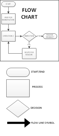
Flowcharting/Stratification

Stratification (per the definition of the ASQ) is the act of sorting data, people, and objects into distinct groups or layers, used in combination with other data analysis tools. I’m sure many of us reading this have dealt with the pain of ordering a huge mountain of non-sorted data into the appropriate “buckets” that will allow meaningful patterns to emerge. This is stratification, and a critical step to take during the data collection planning process is to determine the most effective strata for effective and efficient analysis. My personal preference is to have the collected data noted by geometric location, line, workstation, shift, date, product/process, and operator. Any other factors can be added as required, but this usually covers the key elements on a broad scale. The best time to use the stratification tool is to set up the data collection process so that all data is collected stratified, allowing each element to be easily analyzed and emergent patterns to clearly be recognized, otherwise much time will be spent sifting through data later. Flow Charts create their own kind of “bucket”. Each step of the process is separated and clearly defined, preferably with the next step considered the “customer” of the previous step. The graphic representation of the process displays the elements, components, or tasks associated with a process. A Flowchart can be a high-level view of a process and quite simple or can zero in on every step of the process (30,000 ft vs Ground Level). The high level would be employed when you are trying to determine where the problem is. After you have narrowed the problem down to a specific portion of the process a more detailed evaluation of the flow can help you while you are determining a root cause, but Flowcharts are usually aids, and only every now and then are obvious root causes revealed through a flowchart. Flowcharting should be the first step in a problem-solving exercise. If the flowchart already exists, be certain it is up to date with the current process. So you know, in the modern data driven world, Stratification has become built in to our data analysis, and as the Process driven concept evolved, in an environment where stratification became taken for granted, Flowcharts gained much more prominence. It is still very critical to understand both concepts.
Pareto Chart

Per ASQ definition, a Pareto Chart is a bar graph with some special properties. The lengths of the bars represent frequency or cost (time or money for instance) and are arranged with longest bars on the left and the shortest to the right. In this way the chart visually depicts which situations are more significant. The Term Pareto chart exists thanks to Vilfredo Pareto, who originally postulated the concept of the “80/20” rule to explain economic occurrences known as the “vital few” and the “trivial many”: It was observed by Pareto that approximately 20% of economic factors were the most vital to the outcome economic situations, with the remaining 80% of the factors being only of trivial to the final outcome. Juran and Gryna(1980) adapted the principle for quality applications to help quality improvement professionals focus on the 20% of categories/factors that had the most impact to the process.
As for when to use a Pareto chart, it can frequently be applied throughout the process; At the beginning of a new Quality Improvement project is usually when the attempt to narrow down the most vital areas to address for improvement is made. After the project has been identified, the team can use a Pareto chart to select the best areas to focus on, especially if there are too many possible paths to address. This is a good reason to have stratified data. It makes creating a Pareto chart much easier. If the team has a visual indication of where the most likely area for a solution is, then cross functional teams will find it easier to harmonize.
You will find that a Pareto chart can help you in day to day decisions, such as choosing a new vehicle. Some choices may be quickly eliminated from consideration based upon frequency of complaints and when you are down to just a few, the analysis must continue.
The implementation of a Pareto chart today is very easy. Minitab, Excel and many other forms of software can quickly produce a Pareto chart from the raw data. If you don’t have the software, the process is fairly simple:
- Rank the categories of data from highest frequency or relative frequency from highest to lowest from left to right.
- Label each Axis in a way that clearly defines the categories and the unit of measure
- Draw bars for each category that correspond to their respective counts. Keep the width of each bar the same
- Add Cumulative Counts and lines depicting the rising total. The final category on the right should may be marked “Other” to avoid a potential long list of trivial counts.
Cause-and-Effect Diagrams (Ishikawa)

Next is the Cause and Effect Diagram a.k.a. C&E Diagram, Fishbone (the most common term), or its proper term “Ishikawa diagram”. This tool was developed and popularized during the 1960s by Kaoru Ishikawa, one of the founding fathers of modern quality management. The term fishbone obviously is derived from its resemblance in shape, to that of a fish skeleton. The tool was developed to visually document the analysis of factors that impact a single problem or opportunity. The Causes are the factors, the Effect is the problem or Opportunity.
The C&E Diagram is most effectively employed in problem solving situations where the root cause of the problem or main cause(s) of the opportunity is unclear, but team members have situational awareness of the problems and potential causes. The tool is best utilized with a cross-functional team led by a facilitator who can help move roadblocks along. This usually occurs during an analysis stage of a six-sigma project or during the root cause investigation of a corrective action.
The method of using a Fishbone diagram is relatively simple but very useful for visual recording of team discussions. First, the problem or opportunity is stated inside a rectangle using a short description on the right side of the diagram- the “head” of the fishbone. Next, the major contributing factors are identified and stratified based upon the category each factor falls into. Sometimes one factor can be noted in multiple categories. This is usually the 6Ms (Mother Nature-environment-, Manpower-people-, Methods, Machinery-equipment-, Materials and Measurement). There are other variants based upon the task (service/management/sales) and the categories can be adjusted as the team desires, just be sure your net of categories is sufficient. After the major causes have been identified, the driving factors of each major cause are identified as “bones” added on to the original bones of the main skeleton, and the best way to inquire about each cause and sub-cause is to use the classic “why might this have happened?”. At this phase you do not yet need concrete data (though it will help greatly), so it should be subject matter experts helping to focus the potential causes in order to focus the team.
At the end of the exercise you should have a likely driving factor or factors for each category of bone that was relevant, allowing the investigation to proceed further. Sometimes at this point the team can feel that there are just too many things attacking our process, but the next step would be to continue, using Pareto Analysis based upon a common standard KPI being impacted by all factors on all of the driving factors in order to determine which ones are of greatest priority, and also to look at XY Diagrams for each driving factor vs Effect (see next section).
Back to using a Fishbone diagram to choose a new Car- If you gathered several auto enthusiast friends and help them hash your fishbone diagram out based upon your opportunity to purchase a new car, you may not determine what car to buy, but you would likely determine what areas of concern to watch for in your search, and focus your coming investigation based upon your team’s input. You might even find yourself doing some research to determine if any of cars or types of cars should be eliminated based upon the root causes of the most concerning factors you flagged.
Scatter Diagram/XY Diagram
Scatter Diagrams (also known as XY Diagrams) are used to graphically display quantitative indications of a relationship between two variables (usually an input factor and an output). What this effectively does is evaluate the performance of the input variable(X) to the output variable(Y), hence, the term XY diagram. What is being investigated is how these two variables correlate. When two sets of data are strongly linked together, they have a high Correlation. The term Correlation is made of Co- (meaning “together”), and Relation. Correlation is Positive when the values increase together, Correlation is Negative when one value decreases as the other increases, and when there is no discernable relationship there is no Correlation.
| See Example Below |

The method of employing a XY diagram does not require any deep statistical knowledge. The input variable should use the X axis, and the resulting output variables from the same operation, product, or time period, etc. should be noted in the corresponding Y axis (Excel, Minitab, and most other statistical software (JMP or R) are very effective at producing XY diagrams, or you can do it by hand by simply entering creating a graph on some graphing paper using a ruler (adjust the scale you draw the graph at so the most of the page is used). You do not need to know the correlation coefficient to see a strong relationship, as any strong correlation will usually be revealed visually.
In your research concerning that new car, you might see a strong positive correlation between red cars and speeding tickets and a strong negative correlation between hatchbacks and repair costs, but neither can be directly attributed to causality. Correlation does not imply causality, it only gives you a statistical leg to stand upon. Statistical Significance is a different matter entirely.
Check Sheets

Check Sheets (also knows as Tally Sheets) are a tool used to summarize and potentially visually represent a tally of event occurrences. This tool is most effective during an investigation when output events such as defects (or perhaps input events known/suspected to contribute to a defect) are being counted.
This method of utilization can be performed by hand using pen and paper but can also easily be performed on an electronic tablet. If the check sheet data is going to be moved to computer format, the data will be more reliable if it is initially entered using a computer format that allows for the transfer of data without error, as data transfer is a frequent point of failure.
Your check sheet should be uniquely designed to capture the specific data required to analyze the process, so any and all information pertaining to the process should be included. Generally, the elements that should be included at a minimum are: ID of Product & Process, Time frame of data collection period (per the data collection plan), Individual accountable for product or process and Individual accountable for the data collection, and traceability elements. The Check Sheet should include a clear data collection space to record data for event occurrences, as well as a space for comments.
The Data is recorded during the time frame for all events designated to be monitored. A simple check mark, dot, or X for each type of event will be recorded when it is observed (just one mark for each occurrence). After the designated time frame is complete the tally sheet itself will give a rough graphic representation of what events were most prevalent, but the data can easily be utilized using other tools such as Pareto Charts or Histograms (see next section).
When you are talking to all of your friends while searching for that new car you might enter the results into a check sheet on your phone anytime a bad report comes in from a bad dealership, and keep a tally sheet for good reports. That will help you decide which dealership to choose based upon customer service check sheet results.
Histogram
Histograms are normally used to visually represent the frequency of occurrences of events with event occurrences sorted into categories of defined ranges across the horizontal axis (called bins). Histograms help graphically display the distribution of event occurrences used to present “continuous data”, that is data that represents measured quantity (such as miles on a car). The data would then be collected into specific range categories to present a histogram when it is critical to understand how a particular set of data are distributed relative to each other. The Data are recorded in each column or category as they occur and columns are not sorted by frequency.
To construct a histogram from a continuous variable you first need to determine the amount of data to be used. If you were researching used cars, Miles on the odometer would be your horizontal, split into bins, with the recommended number of bins equal to √n. Each bin contains the number of occurrences in the data set that are contained within that bin. The resulting histogram (if enough data were collected) would clearly display your current bell curve of used car odometer readings and provide a visual of what the norm should be for a used car. This would help you avoid buying a car with too many miles on it and might help you spot a good deal.
When presenting the graphic, always provide a descriptive title, label each axis, provide a measurement scale for each axis, label the columns, and provide a data summary.
Histograms are usually considered large sample tools and are not really very reliable for small sample sizes. I would go with 50, and do not go with anything under 30. Statistical software, even Excel will help you with histogram creation.

9000 11000 11000 12000 12000 11000 12000 12000 13000 13000 14000 14000 15000 15000 20000 20000 20000 20000 30000 30000 30000 30000 30000 30000 40000 40000 40000 40000 40000 40000 45000 45000 45000 45000 45000 45000 45000 55000 55000 55000 55000 55000 55000 55000 55000 65000 65000 65000 65000 65000 65000 65000 65000 65000 65000 75000 75000 75000 75000 75000 75000 75000 75000 85000 85000 85000 85000 85000 85000 95000 95000 95000 95000 95000 95000 95000 95000 95000 105000 105000 105000 105000
Control Chart/Run Chart

Run Char Example
If you add control limits to the run chart, it will become a control chart. The control chart is also known as the Shewhart chart because it was developed by Walter A. Shewhart while working in Bell Labs. These charts are used to study the change in the process over some time. Though I am a strong believer in the power of SPC (statistical process control), as I have witnessed it in action, I will address only the Run Chart aspect of the 7 basic tools and save Control Charting and general SPC for a later post.
Run Charts are very effective tools used to track and monitor a metric or parameter without regard to control limits or tolerances and are frequently used to help Quality Engineers be come fully aware of how a metric/process is performing over time. This knowledge provides another signpost on the journey toward root cause analysis.
The basic method of creating a run chart is
- Select a single parameter to monitor
- Set a scale for the y-axis in a way that will distribute the data throughout the scale.
- ID the time intervals for the graph. (It should be based upon how data is collected)
- Collect and chart the data. (Minitab, Excel or any other SPC software can be used)
- Calculate the Average and plot the average on the Run Chart.
Conclusion
These tools, while helpful for most quality assurance teams, are primarily intended for quality control, or to be employed in concert as the precursor to Root Cause Analysis when a problem has many potential causes and the team needs to help focus on the most likely causes, allowing the team to move toward a final Root Cause Analysis in which the team can come to a consensus and execute a full-blown corrective action. The tools are versatile and because they are basic can be employed in many different combinations.
Though you can never really know if that car you purchase will break down quicker than you hope, or if its color will trigger a ticket writing spree by every officer that observes you, what employing the tools in real life can do is help you focus on the more likely problem areas so you can move on to a final analysis and final decision. I would advise you to not get caught up in over analyzing, or you will just go in circles without deciding (commonly referred to as Analysis Paralysis). If you are searching for a root cause in order to correct it, narrow down the potential causes to the most likely cases and then (with team input) pursue the potential cause(s) with the most return potential to the customer first, then the other stakeholders as determined by strategic alignment.


Processing…
Success! You're on the list.
Whoops! There was an error and we couldn't process your subscription. Please reload the page and try again.
