What is an A-3 Report?

REFLECTION: FOR STUDENTS: “Having no problems is the biggest problem of all.”- Taiichi Ohno
FOR ACADEMICS: “Data is of course important in manufacturing, but I place the greatest emphasis on facts.”- Taiichi Ohno
FOR PROFESSIONALS/PRACTITIONERS: “Make your workplace into showcase that can be understood by everyone at a glance.”- Taiichi Ohno
Foundation
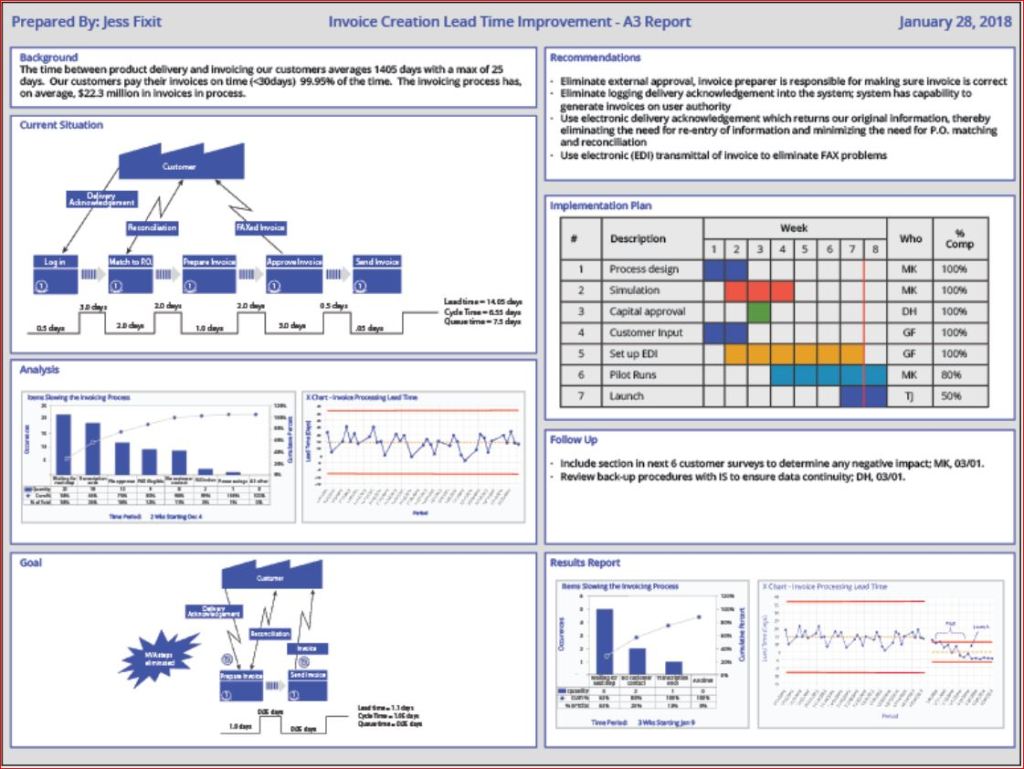
The A3 Report is a model developed and used by Toyota and currently used by many businesses around the world. The A3 Report is named for a paper size-A3 (29.7 x 42.0cm, 11.69 x 16.53 inches). The entire current state and PDCA aspects of the project are captured visually for easy communication and reference. When CIP projects use an A3 methodology to track projects, it has been demonstrated that clear visual communication helps the team members and the overall organization be more aware of the team’s progress.
A minor improvement event, in my experience, is generally four weeks to six weeks. Still, when an issue needs to be addressed thoroughly, the organization must be willing to invest more time and resources. Almost every moment of improvement time spent may be wasted if the true root cause is not adequately addressed due to failure to properly invest resources. There are four distinct phases: 1) preparation and training; 2) process mapping and current state analysis; 3) process mapping and future state analysis; and 4) implementation and ownership. I will put up a basic template below and walk through the A3 report.
Example

- Clarify the Problem
- IS/IS Not Analysis-excellent first tool to use to define the scope of the problem.
- After the scope of the problem has been defined, define the problem relative to the organization or process. The focus should always be on an underlying process or systematic issue, not an individual failure. Systematic failures are frequent but can be corrected with teamwork. The problem statement should never include a suggestion for a solution.
- Breakdown the Problem
- Clearly define the problem in terms of the 5 Why’s and 2 W’s (Who?, What?, When?, Where?, Why? And How?, How much or often?
- Set goals for improvement towards the ideal state vs current state
- Team sets S.M.A.R.T. goals relevant to block 1 state, establishing the end improvement target
- Root Cause Analysis
- Team uses focus areas from block 2 to determine Root Cause(s) employing relevant RCA tools
- Common RCA tools
- Cause-Effect/Fishbone Diagram
- 5 Why Analysis
- Fault Tree Analysis
- Pareto Chart
- Clearly state the determined root cause(s) and display the output of the tools
- Develop Countermeasures
- The team should take the root cause/causes from Block 4 and assign specific countermeasures.
- Countermeasures should directly address the root cause and, in theory, should solve the problem identified in Block 1.
- The completed fifth block is populated with any tool that will outline the countermeasures.
- Implement Countermeasures
- The team tracks the countermeasures from Block 5 and ensures each one is accomplished.
- The completed sixth block should be populated with the tool used in Block 5 to outline the countermeasures and updated as each is accomplished.
- Monitor Results and Process
- Effectiveness Check of Countermeasures
- Before/After Analysis
- SPC Control Charts
- Use Data from block 1 to determine if countermeasures from block 5 are having the desired effect relative to the target.
- If countermeasures are not effective, go back to RCA-block 4 (PDCA) and reconvene.
- Use the tool from block 6 to track countermeasure as ineffective in Block 7
- Effectiveness Check of Countermeasures
- Standardize successful processes
- If countermeasures are effective-
- Standardize all successful processes and note successful countermeasures as Standardized as they are approved using the tool from block 6 in Block 7
- A separate block can be used for Standardized processes
- If countermeasures are effective-
Conclusion
A complete A3 report can use many different tools, depending upon the problem being examined, so don’t fall into the habit of always using the exact same format. Be certain all four phases are completed. Innovation comes from creativity, so leave behind SOPs that demand exact clones of past reports. You may be dealing with a problem no person in your organization has yet to encounter, so outside of the box is thinking should always be on the table (Not locked away in a closed mind)

Processing…
Success! You're on the list.
Whoops! There was an error and we couldn't process your subscription. Please reload the page and try again.


Bibliography
Quality Management Journal, Volume 16, 2009 – Issue 4
Published Online: 21 Nov 2017
Quality Progress Volume 49, 2009 – Issue 1
Jan 2016
Basic QA Statistics Series (Part 6) How to Read a Box-and-Whisker Diagram

REFLECTION: FOR STUDENTS:
”Images are the most powerful communicator we have.”
– John Berger, 1926
FOR ACADEMICS:
”We live in a visual intensive society.”
– Paul Martin Lester, 2006
FOR PROFESSIONALS/PRACTITIONERS:
”There is more to visual communications therefore than simply making an image for the eyes to perceive, it has to accommodate the mind of the person being communicated to. That is to say you are not merely making something to be perceived when visually communicating, you are fundamentally making something to be thought about.”
– Aldous Huxley, 1894 –1963
Foundation
The last post promised discussion on the Box-and-Whisker Diagram (or Box Plot). Similar to the Histogram, a box plot is a graphic tool that displays the distribution of the data, but with a critical difference. The box plot shows the Quartiles (minimum, 1st, median, 3rd, and maximum) and clarifying the Interquartile Range- IQR (See the last post) using a box. The “whiskers” of the plot are the minimum and maximum.
Box plots are very useful for quick comparison of multiple sets of data, especially when the focus is on the most critical aspects of the data, or there are not enough data points in each data set to create a reliable histogram. Different Softwares will provide descriptive statistics like the mean value as well.

As you can see, box plots are excellent tools for quickly depicting variation between shifts or machines. Minitab is very effective, but most stat software (even Excel) can easily create a box plot for a presentation with minimal extra effort.
Conclusion
I will be signing off on this short intro to QA statistics, though I will eventually return with a more in-depth series after I have turned my attention back to the broader world of Quality Culture for a while. Thank you all for your enthusiasm for this subject! If you have any subject suggestions, please send them to me!
Processing…
Success! You're on the list.
Whoops! There was an error and we couldn't process your subscription. Please reload the page and try again.
Basic QA Statistics Series(Part 5)- Basic Histogram

REFLECTION: FOR STUDENTS: When that graph pops up showing you data in histogram, pay closer attention to everything the graph is conveying, because effective conveyance of data is the future
FOR ACADEMICS: Teach your students how to use visual data graphics, and correct them when they slip up. From teachers to the boardroom, being able to construct a histogram for a presentation is a vital skill for information conveyance.
FOR PROFESSIONALS/PRACTITIONERS: Excel and Minitab do the job, but always remember the underlying theory behind the graphs for when the software goes down, or you need to do it quickly without a computer.
Foundation
As Promised from the last post from this series, we will now delve a little bit into histograms. The primary purpose of a histogram is to provide a straightforward graphic representation of the distribution of data. I’m sure everyone has heard the term “a picture speaks a thousand words.” To demonstrate this, I will show you three histograms and think you will see before you read any caption which histogram looks like useful data. Sample data should appear pretty much like a bell curve to be declared “normal.”

When the “Tail” is to the left the data is left skewed- and look at that clear outlier bin

A histogram with an almost perfectly normal distribution

When the “Tail” is to the left the data is right skewed
The histogram is a quick communication of the state of the data. When you see the strong left or right skew, you must investigate the outliers and determine why you have so many.
Constructing a Histogram from your Data
To construct a histogram from a continuous variable, you need to determine the amount of data to be used. If you were researching problems with a production line, Cost would be your horizontal, split into bins, with the recommended number of bins equal to √n (n being the number of samples), and the bins having set boundaries. Fifty data points should be your minimum. Each bin will separate the data into classes based upon frequency, but the histogram will not show you the raw data, only represent the frequency distribution. I would suggest familiarizing yourself with your company’s statistical software so that everyone uniformly performs the analysis. Having the statistical guidelines per the software will save you in some auditing situations. Minitab, Excel, and many others provide straightforward access to histogram construction. (Kubiak, 2017) Most software equalize the width of the bars, but the way I have seen the width determined by hand most often is:
- Determine # of Bars to use based upon the sample size
- Sample size of 100 or less: 7-10 Bars
- Sample size of 100-200: 11-15 Bars
- Sample size of 201 or more: 13-20 Bars
- Choose # of Bars to use
- Width(W) = Overall Range of Data (R) / # of Bars(B)
- W=R/B.
- Keep adding W to the previous bar to find the lower edge of the next bar, starting from 0
(Tague, 2005)
Conclusion
Histograms are kind of like a way to count your data frequency of occurrence within set boundaries, and then show graphically how your data is distributed. Always remember that if a histogram is constructed with too many or too few bins, it can be manipulated misleadingly. Always check the numbers yourself! This tool is one of the Seven Basic Quality Tools and meant to be used to help flag issues like outliers or non-normal data. It is not something that can solve a problem on its own, but a tool that enables you to understand what the data is telling you. The next post we cover will talk about another visual stat tool- the box and whisker diagram (for any cat lovers 😊).
Processing…
Success! You're on the list.
Whoops! There was an error and we couldn't process your subscription. Please reload the page and try again.
Create Amazon Business Account
Bibliography
Kubiak, T. a. (2017). The Certified Six Sigma Black Belt Handbook Third Edition. Milwaukee: ASQ Quality Press.
Tague, N. R. (2005). The Quality Tool Box. Milwaukee: Quality Press.
Basic QA Statistics Series(Part 4)- Interquartile Range-IQR
REFLECTION: FOR STUDENTS: A good rule in organizational analysis is that no meeting of the minds is really reached until we talk of specific actions or decisions. We can talk of who is responsible for budgets, or inventory, or quality, but little is settled. It is only when we get down to the action words-measure, compute, prepare, check, endorse, recommend, approve-that we can make clear who is to do what. -Joseph M. Juran
FOR ACADEMICS: Without a standard there is no logical basis for making a decision or taking action. -Joseph M. Juran
FOR PROFESSIONALS/PRACTITIONERS: Both pure and applied science have gradually pushed further and further the requirements for accuracy and precision. However, applied science, particularly in the mass production of interchangeable parts, is even more exacting than pure science in certain matters of accuracy and precision. -Walter A. Shewhart
Foundation
When we left this small series on basic QA statistics, we had just discussed basic measures of Dispersion- Range, Variance, and Standard Deviation. As promised, we are now covering the basics of Interquartile Range (IQR for short). IQR is also a measure of dispersion, but as I’m sure you will be exposed to IQR in the future, I thought it best to give it a separate post.
The IQR range, like the other measures of dispersion, is used to measure the spread of the data points in a data set. IQR is best used with different measurements like median and total range to build a complete picture of a data set’s tendency to cluster around its mean. IQR is also a very useful tool to use to identify outliers (values abnormally far from the mean of a data set), but do not worry about the more in-depth math.
First, to Define all of the aspects of IQR
-First Quartile (Q1)- The value at which 25% of the data are less than or equal to this value (does not have to be a value in the data set).
-Second Quartile (Q2)- The value at which 50% of the data are less than or equal to this value. It is also known as the median. The second quartile or median does not have to be a value in the data set.
-Third Quartile (Q3)- This is the point at which 75% of the data are less than or equal to this value. It also does not have to be in the data set.
-Fourth Quartile (Q4)- This value is the maximum value in the data set (100% of the data are less than or equal to this value).
-Interquartile Range (IQR)- IQR is the Third Quartile minus the First Quartile and considered a measure of dispersion.
(Kubiak, 2017)
Calculating Quartiles
There are several methods for calculating quartiles, so the technique I am going to use is just what I consider the most basic without delving into any more in-depth math.
Steps:
- Order the data set from smallest to largest.
- Determine the median (reference my post: Basic QA Statistics Series(Part 2)- Basic Measures of Central Tendency and Measurement Scales).
- This determination separates the data into two sets (an upper half and lower half). This Median is Q2
- The First Quartile (Q1) is found by determining the median of the lower half of the data (not including the Median from the previous step when calculating the lower half data set median).
- Q3 is the median of the upper half of the data set, not including the value for Q1 in the top half median determination
- Q4 is the maximum in the data set.
(Kubiak, 2017)

Data Set: 22,26,24,29,25,24, 23,26,28,30,35,40,56,56,65,57,57,75,76,77,74,74,76,75,72,71,70,79,78, 1000,10,12,13,15,16,12,11,64, 65,35, 25,28, 21,44,46,55,77, 79,85,84,86,15,25,35, 101,12,25,35,65,75
Conclusion
As you can see, I stacked the data deck with a massive outlier in the data set. 1000 is far from the mean, but the IQR is not affected by this enormous outlier, as it only takes into account Q1 and Q3.
This property of IQR helps prevent outliers from convincing you the mean is just fine, when in fact, the entire system may be out of whack but compensated for by outliers in your data. The little chart you see is called a Box and Whisker plot, and we will give it a separate post later after we discuss Histograms in the nest post.
Processing…
Success! You're on the list.
Whoops! There was an error and we couldn't process your subscription. Please reload the page and try again.
Create Amazon Business Account
Bibliography
Kubiak, T. a. (2017). The Certified Six Sigma Black Belt Handbook Third Edition. Milwaukee: ASQ Quality Press.
Basic QA Statistics Series(Part 3)- Basic Measures of Dispersion and Statistical Notation

REFLECTION: FOR STUDENTS: “It is not possible to know what you need to learn.” -Philip Crosby
FOR ACADEMICS: “Quality is the result of a carefully constructed cultural environment. It has to be the fabric of the organization, not part of the fabric.”-Philip Crosby
FOR PROFESSIONALS/PRACTITIONERS: “Quality has to be caused, not controlled.”-Philip Crosby
Foundation
Before we go further, this post will give you the basic notation for simple statistics so we can communicate more efficiently. It will also make understanding instructions from textbooks much less challenging. Please don’t give up here. These notations are just a secret code mathematicians use. If you learn it, you will begin to see that statistics is quite accessible. After the code is passed on, we will move on to the Measures of Dispersion.
Review: Part 1 and 2 covered the definition of Population, Sample, and how the terms Parameter and Statistic relate to Population and Sample, respectively. Also, we covered the concept of what data is, as well as the different kinds of data that exist, and the measurement scales used to analyze measurement data.
STATISTICAL NOTATION
Typically, capital letters and Greek letters are used to refer to population parameters, and lower-case or Roman letters are used to note sample statistics.
I will be providing information in the table below specifically for this post. As posts are added in the series, more tables will be added to address any other notations referenced in the future. This post will become the notation reference page to allow any who are new to statistical notation an easy reference.

(Kubiak, 2017)
MEASURES OF DISPERSION
There are three primary Measures of Dispersion- Range, Variance, and Standard Deviation. I will address each and explain them plainly. If you are new to statistics, I will avoid mathematics as much as possible, but alas, you will find it inescapable.
First comes RANGE. Range is probably the most well known and most easily understood. Range is simply the difference between the largest (Maximum or MAX) value and the smallest (Minimum or MIN) value in a data set.
Example: 24, 36, 54, 89, 12, 14, 44, 55, 75, 86
Min 12, Max, 89
Range (R)= Max-Min = 77
Though Range is easy to use, it is not always as useful as the other measures of dispersion, because sometimes two separate data sets can have very similar ranges, with the other measures looking nothing alike. On that note, comes something a bit more complicated.
At first, it sounds pretty simple:
VARIANCE- This is the measure of how far off the data values are from the mean over-all. Obtaining this measurement by hand can be painful. You have to find the difference between the mean and each data point in the population or sample, square the differences, and then find the average of those squared differences.
Variance RoadMap
- Calculate the mean of all the data points Calculate the difference between the mean and each data point(Xi – μ or x ̅), Xi being a representation ith value of variable X.
- Square the calculated differences for all data points
- Add these Squared values together
- Divide that number by N if the data set is a population (N), or divide by n-1 if the data is a sample
Follow the underlined statements above, and the formula for Variance below is achieved, but most stat software will calculate Variance with minimal effort.
Sample

Population

Standard Deviation (SD)
A negative of Variance is though you can measure the relative spread of the data, it is not representative of the same scale because it has been squared. For example- data collected in inches or seconds and then checked for variance is effectively square inches or seconds squared.
Standard Deviation is more useful because the units of Standard Deviation end up on the same scale and are directly comparable to the mean of the population or sample. Standard Deviation is the Square Root of the Variance and can be described as the average distance from each data point to the mean. The lower the SD, the less spread out the data is. The larger the spread of data, the higher the SD. Once again, most Stats programs and calculators will provide SD with no problem. The SD helps you understand how much your data is varying from the mean.
Two Examples: (using sample sets)
Set 1: 35, 61, 15, 14, 1
Mean(Set 1): 25.2

Set 2: 45, 48, 50, 43, 40
Mean(Set 2): 45.2
S=√(((45-45.2)²+(48-45.2)²+(50-45.2)²+(43-45.2)²+(40-45.2)²)/4)=3.96
When you first glance at the small sample of data, set one looks like it has a much larger spread from the average than set two. When you run the numbers, the SD results back up your “gut feeling.” An analysis is always better than a “gut feeling,” no matter how intuitive you are. The larger the sample set you are looking at, the more the initial appearance of the data can mislead you, so always run those numbers!
Conclusion
To recap, Range is the most well-known and straightforward Measure of Dispersion, but only describes the dispersion of the extremes of the data, and therefore may not always provide much new information. Range is usually most useful with smaller data sets. I should also mention a term known as the Interquartile Range (IQR). I will be dedicating a separate post to IQR next post.
Variance is an overall measure of the variation occurring around the mean using the Sum of Squares methodology. Remember, variance does not relate directly to the mean, so you cannot evaluate a variance number directly, so you should use variance to see how individual numbers relate to each other within a data set. Outliers (data points far from the mean) gain added significance with variance as well. Standard Deviation tends to be the most useful Measure of Dispersion, as it relates directly to the mean, and can be used to compare the spreads of various data sets. Remember, your stats programs will help you, and many online resources will walk you through any calculation. If you have any questions, shoot me a comment, and I will answer it for you. See you next time as we dig a bit deeper into IQR. 😊
Processing…
Success! You're on the list.
Whoops! There was an error and we couldn't process your subscription. Please reload the page and try again.
Create Amazon Business Account
Bibliography
Kubiak, T. a. (2017). The Certified Six Sigma Black Belt Handbook Third Edition. Milwaukee: ASQ Quality Press.
Basic QA Statistics Series(Part 2)- Basic Measures of Central Tendency and Measurement Scales

REFLECTION: FOR STUDENTS: Learning is not compulsory… neither is survival. – W. Edwards Deming
FOR ACADEMICS: Our schools must preserve and nurture the yearning for learning that everyone is born with. -W Edwards Deming
FOR PROFESSIONALS/PRACTITIONERS: Data are not taken for museum purposes; they are taken as a basis for doing something. If nothing is to be done with the data, then there is no use in collecting any. The ultimate purpose of taking data is to provide a basis for action or a recommendation for action. The step intermediate between the collection of data and the action is prediction. -W. Edwards Deming
Foundation
The previous post covered just the definition of Population and Sample and the descriptions of each using Parameters for Population and Statistics for a Sample. We also mentioned data. To be able to communicate about data, we first have to define data. Define should always be the first step for better understanding.
Data are characteristics or information (usually numerical) that are collected through observation. In a more technical sense, data consists of a set of values of qualitative or quantitative variables concerning one or more persons or objects.
The two broadest categories of Data are: Qualitative and Quantitative-
Qualitative data deals with characteristics and descriptors that cannot be easily measured but can be observed in terms of the attributes, properties, and of course, qualities of an object (such as color and shape). Quantitative data are data that can be measured, verified, and manipulated. Numerical data such as length and weight of objects are all Quantitative.
On the next level of Data are Discrete and Continuous Data.
Discrete Data– Pyzdek and Keller defined discrete data as such: “Data are said to be discrete when they take on only a finite number of points that can be represented by the non-negative integers” (Kubiak, 2017). Discrete data is count data and sometimes called categorical or attribute data. A count cannot be made more precise. You cannot have 2.2 fully functional cars.
Continuous Data– Pyzdek and Keller state- “ Data are said to be Continuous when they exist on an interval, or on several intervals.” Another term used is Variable data. Height, weight, and temperature are continuous data because between any two values on the measurement scale, there is an infinite number of other values (Kubiak, 2017).
Measurement Scales
- Nominal
- Classifies data into categories with no order implied
- Ordinal
- Refers to data positions within a set, where the order is essential, but precise differences between the values are not explicitly defined (example: poor, ok, excellent).
- Interval
- An Interval scale has meaningful differences but no absolute zero. (Ex: Temperature, excluding the Kelvin scale)
- Ratio
- Ratio scales have meaningful differences and an absolute zero. (Ex: Length, weight and age)
(Kubiak, 2017)
I know that it seems like a lot to digest, but recording data correctly is critical. Next, we will discuss the Central Limit Theorem: Per the central limit theorem, the mean of a sample of data will be closer to the mean of the overall population in question, as the sample size increases, notwithstanding the actual distribution of the data. In other words, the true form of the distribution does not have to be normally distributed (a bell curve) as long as the sample size is sufficiently large(Kubiak, 2017). There will eventually be a separate post(s) on sampling, distribution, and choosing the ideal sample size, but we are starting at the basics.

Note: Ordinal Data can be confusing. It depends on the how the ordinal scale is arranged. The Likert Scale would be considered quantitative ordinal, while the Movie rating scale would be considered qualitative ordinal.
(Kubiak, 2017)
Measures of Central Tendency
Three Common ways for quantifying the centrality of a population or sample include the
- Mean
- Arithmetic Average of a data set. This is the sum of the values divided by the number of individual values Ex: [1,3,5,10] Average is 4.75
- Median
- This is the middle value of an ordered data set. When the data are made up of an odd number of values, the median value is the central value of the ordered set. [1, 3, 5], so 3 is the median. When there is an even number of data points, the median is the average of the two middle values of the ordered set [1, 3, 5, 10]. In this case, the Median is the average of 3 and 5: (3+5)/2=4
- Mode
- The mode is the most frequently found value in a data set. It is possible for there to be more than one mode. EX: [1,2,3,5,1,6,8,1,8,1,3]- The Mode is 1
(Kubiak, 2017)
Conclusion
Correctly recording Data and using the proper scale to track your Data is the first step to understanding your process outputs.
A next baby step is knowing how to measure your process based upon your data scale. Being able to calculate the Measures of Central Tendency helps you, but Stats software will do much of this for you. Still, you need to know what you are seeing. It is always most helpful to know what those stat software programs are doing with your data so you can more robustly defend your decisions. Next time we will go a little deeper and talk about Measures of Dispersion (and it is precisely what it sounds like!).
Processing…
Success! You're on the list.
Whoops! There was an error and we couldn't process your subscription. Please reload the page and try again.
Create Amazon Business Account
Bibliography
Kubiak, T. a. (2017). The Certified Six Sigma Black Belt Handbook Third Edition. Milwaukee: ASQ Quality Press.
Intro to Basic QA Statistics Series (Part 1)

REFLECTION: FOR STUDENTS: Don’t throw your stat’s books away. You will use them one day, and unlike most other textbooks, old statistics textbooks are usually just as valid as they were years ago.
FOR ACADEMICS: Yes, teach your students to use R and Minitab, but be sure they can do the calculations by hand
FOR PROFESSIONALS/PRACTITIONERS: I know you likely are old hands at this, but thank you for any advice you can provide those entering the QA field who have questions. Stats sometimes seems mystifying, so be sure to share the knowledge with mentorship.
Foundation
Most in the industrial world understand that tracking and analysis of data is a requirement to know if a process is producing waste or if your process is stable and everything is running as it should. The problem that arises from time to time is the “craftsman attitude” of a process owner, or perhaps even that same attitude in a plant manager.
What I am describing with the term -“craftsman attitude”- is the acquired belief of a knowledgeable Subject Matter Expert or Expert Operator, which leads a person to decide of their own accord they are wise enough to make a critical decision without proper Data Analysis.
At this point in any conversation with a person trying to argue they do not need Data, I would quote Deming- “In God we trust, all others must bring DATA.”
This phenomenon is likely a combination of two primary things:
Resistance to Change and a natural aversion (at least in Western Society) to developing a deep understanding of mathematics. Resistance to Change is inherent in many human beings and very hard to overcome. Awareness of the potential Resistance and how it may influence your decisions can help mitigate how you react to Quality Improvement issues.
Mathematics is something you must pursue on your own unless you were gifted with a natural aptitude (as the school systems are not very effective when it comes to producing mathematically educated high school graduates). Fear not.
Lack of mathematical prowess means very little in this day and age. You need only understand the basic concepts of statistics and how to apply them, and most stats software will walk you through the rest.
This post will be the first of a few on basic stats to help those who may feel like it is beyond them to help show that it is not that complicated.
I will be keeping the stats on a basic level, and breaking the posts up into digestible bits, so please continue reading 😊
Basic Statistical Terms
The first terms that should be understood first are Population, Sample, Statistic, and Parameter.
-A Population considers every member/unit of a group
-A Sample would be a random surveillance study of a portion of the Population
-A Parameter is Derived from Analysis of the Population
-A Statistic is Derived from Analysis of the Sample of the Population

Conclusion
A Parameter is a description of an entire group (Population). A Statistic is the description of a sample of the Population. Understanding the difference is critical. A Parameter indicates that the whole population has been evaluated in some way to obtain the result.
A Statistic depends upon randomness and sample size to adequately estimate the outcome of the population parameter.
The larger the random sample, the better!
If you have the time and resources, always choose a larger sample size!
-Next Time: Basic Measures of Central Tendency
Processing…
Success! You're on the list.
Whoops! There was an error and we couldn't process your subscription. Please reload the page and try again.
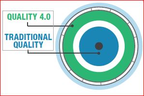
The Technology for Industry 4.0 is Here, but Quality 4.0 is at 3.0 Going on 4.0 (With Still More Growing To Do)!

REFLECTION: FOR STUDENTS: Are the current Management frameworks you have been taught sufficient for Industry/Quality 4.0, or will you have to shift your perspective to be viable?
FOR ACADEMICS: Are you teaching two years behind (as is common with textbooks) or are you also including the coming impact of Quality 4.0 and disseminating that required knowledge to your students?
FOR PROFESSIONALS/PRACTITIONERS: Always focus maintaining and improving on the current state, but plan for the achievement of the future state or the future state will never be realized.
Industry 4.0
For many years, the quality culture has been the lighthouse that lit the way down the path, guiding industry toward the reduction of waste and higher levels of customer satisfaction and retention, but things have been evolving. Industry has gone through many changes, and those changes always have required Quality to adjust.
Industry revolution 1: machine manufacturing, steam power, and the migration to city living for people who had previously been agriculturalists. (Quality moved from guilds into the role of inspection)
Industry revolution 2: The production line and mass manufacturing drastically reduced the cost of consumer and industrial products. (Quality developed more efficient quality management tools)
Industry Revolution 3: Barely a revolution, but significant. Electronics and control systems have gradually penetrated manufacturing, allowing greater flexibility and more sophisticated products at a significantly lower cost until ERP and PLM have become the standard. (Quality began to utilize data to analyze costs/customer complaints and reduce enterprise costs due to quality failures)
Each industrial revolution brought about new patterns of quality management. As Deming emphasizes, if the industrial culture is not Quality-oriented, it will ultimately displease the customer. Still, right now, the fourth industrial revolution is upon us, and Quality, though fully aware of the future state goals, is still working on perfecting the foundations of Quality 3.0. At the same time, Industry 4.0 is off and running.
Industry 4.0 consists of Many critical technology changes and advancements that have enabled technology to become more predictive and communicative, including advances in data, analytics, connectivity, scalability, and collaboration. The digital impact of the third revolution is magnified dramatically. It evolves industry into a phase where AI helps solve problems proactively rather than picking through the past failures to figure out what went wrong. This phase will touch every aspect of industry, connecting people, machines, and data in new ways, and provides access to technologies that were previously only accessible to a skilled few and heralds transformative capabilities such as those in material science and 3D Printing.

Adapted from Quality 4.0 Impact and Strategy Handook
What is Quality 4.0?
These are the primary axes of Quality 4.0 I want to discuss:
- Data
- Analytics
- Connectivity
- Collaboration
- Scalability
- Management Systems
- Compliance
- Culture
The effect of the implementation of these technologies is essential to quality because they allow for the transformation of culture, leadership, collaboration, and compliance. Quality 4.0 is genuinely not about technology, but the users of that technology, and the processes they use to maximize value. Quality 4.0 doubtlessly includes the digitization of quality management. It is more important to consider the impact of that digitization on quality technology, processes, and people. Quality 4.0 should not be sold as a buzzword system to replace traditional quality methods, but rather as a framework designed to improve upon the practices already in place. Manufacturers should use the 4.0 framework to interpret their current state and identify what changes are needed to move to the future state (just like any traditional CIP project), but do not let the daunting task of implementation scare top management away.
Data:
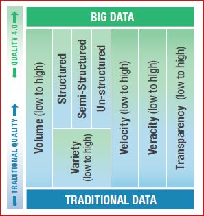
Deming said it best: “In God we trust, all others must bring data.” Data has been driving quality decisions, change, and improvement for a very long time and Evidence-based decision making has become less an anomaly and more the standard. Still, industry has a long way to go toward fully integrating the quality culture. As can be seen in the chart, a portion of the more mature companies have mastered traditional data and have begun leveraging big data. However, the struggle is still genuine and not yet a true cohesive culture across all areas internally or across industries.

Data has five critical elements that must be captured from a practical and cultural perspective-
VOLUME: Traditional systems have a large number of transactional records (e.g., corrective and preventive action (CAPA), NCRs, Change Orders, etc.). The volume of data from connected devices is many orders of magnitude more significant and will continue to grow, requiring specialized approaches such as data lakes, and cloud computing
VARIETY: Systems gathers three types of data: structured, unstructured, and semi-structured. Structured data is highly organized (CAPAs, quality events). Unstructured data is un-organized (e.g., semantics data, data from sensors, and connected devices). Semi-structured data is unstructured and has had structure applied to it (e.g., metadata tags).
VELOCITY: This is the rate at which a company gathers data.
VERACITY: This refers to data accuracy. Quality system data is often low fidelity due to fragmented systems and lack of automation.
TRANSPARENCY: The ease of accessing and working with data no matter where it resides or what application created it.
Analytics:
Analytics are the tools that reveal what the terabytes of data can tell us. Unfortunately, quality often stumbles over analytics. 37% of the market identifies weak metrics as a top roadblock to accomplishing quality objectives. Because there is insufficient adoption of real-time metrics by most of the market, we are often acting on the past, not the current situation.
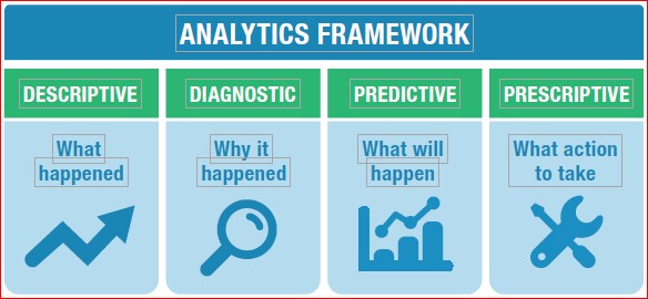
Analytics fall into four categories- Descriptive (number of open quality events), diagnostic metrics (quality process cycle times to identify bottlenecks), Predictive metrics such as trend analysis (application of trend rules to SPC data), and Predictive using Big Data analytics, or Machine Learning (ML)/AI to traditional data or Big Data (predicting failures of a specific machine or process).
Companies attempting to achieve Quality 4.0 should construct their analytics strategy after or concurrently with their data strategy. Powerful analytics applied to low veracity data will only provide low veracity insights.
Connectivity:
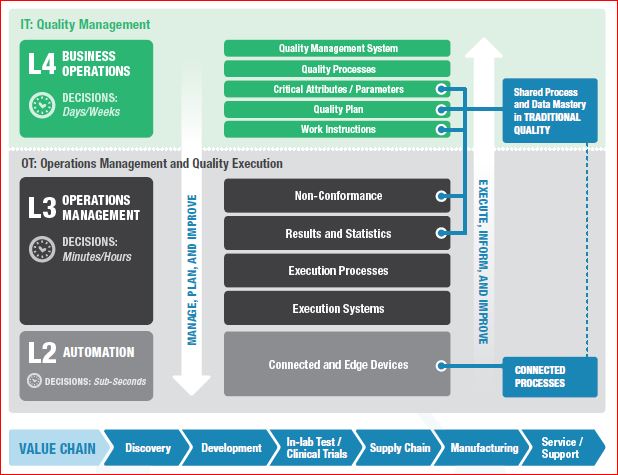
“Connectivity” in the modern industrial age is the cascading multi-direction connection between business information technology (IT) and operational technology (OT), enterprise quality management system (EQMS), enterprise resource planning (ERP), and product lifecycle management (PLM), with OT at the level of technology used in laboratory, manufacturing, and service. Industry 4.0 transforms connectivity through a proliferation of inexpensive connected sensors that provide near real-time feedback from connected people, products and edge devices, and processes.
- Connected people can leverage personal smart devices or intelligent wearable devices that sense workers or their environment. The Connected worker programs usually have goals of increased efficiency and safety.
- Connected products can provide feedback on their performance across their lifecycle.
- Connected edge devices efficiently connect sensed equipment. Edge devices often perform analytics at the device, helping to make predictive/prescriptive decisions (shut this machine down and come for repair), and decide which data to send to central OT systems.
- Connected processes provide feedback from connected people, products, and equipment into processes. This broad element of connectedness allows for the overall reduction of the decision process by providing accessible data and reliable analytics
Collaboration:
Quality management requires collaboration. Quality is inherently cross-functional and global. With the help of digital messaging (email, IM), automated workflows, and online portals, companies execute traditional quality business processes. Much of the market has yet to take advantage of automated workflows and portals, while only 21% have adopted a core EQMS.
Collaboration is a powerful fuel for innovation and quality improvement and has been profoundly transformed and magnified by connectivity, data, and analytics. Leaders should consider how they collaborate and build a secure and reproducible data sharing strategy that meets objectives such as better competency, more streamlined oversight, improved security, and auditability. The approach of collaboration is often part of the culture, and reproducing it can be difficult.
Scalability:
Scalability is the ability to support data volume, users, devices, and analytics on a global scale. Without a global scale, traditional quality and Quality 4.0 are not nearly as effective, and a company is unable to harmonize processes, best practices, competencies, and lessons learned corporate-wide. Thirty-seven percent of companies struggle with fragmented data sources and systems as a top challenge in achieving quality objectives. Scalability is critical to Quality 4.0
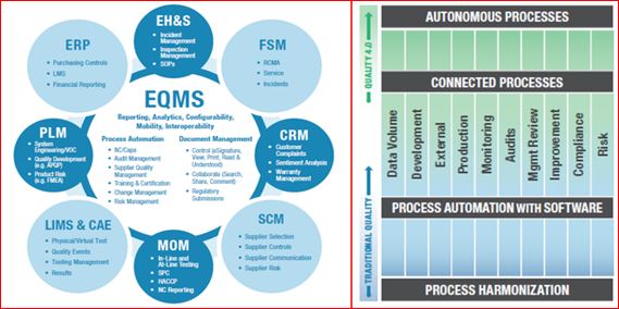
Management Systems:
The EQMS is the Center of all quality management connectivity and provides a scalable solution to automate workflows, connect quality processes, improve data veracity, provide centralized analytics, ensure compliance, and foster collaboration within a universal app. It is a hub because quality touches every part of the value chain and how it’s managed. Over the last 50 years, business has slowly realized that quality was not the bad guy but was, in fact, the helping hand to allowing us to have the capacity to remove much of the hidden factory.
There has been some progress on EQMS adoption, but many companies are still critically lagging. Even those that adopt EQMS have not utilized it in an integrated fashion. Only 21% of the market has adopted EQMS, and of those, 41% have adopted a standalone unintegrated approach, leading to fragmentation. Fragmented core processes and resistance-to-change create the current situation. While CAPA/non-conformance is globally harmonized at 25%, 36% of manufacturers have not harmonized any processes, and the median harmonization rate of a single process is an abysmal 8%
Compliance:
Compliance would include conforming to regulatory, industry, customer, and internal requirements. Life science manufacturers/ have a particularly heavy compliance burden, but many other sectors are even more burdened by compliance with regulations. Compliance is essential to quality teams across all industries since quality often takes a lead role in ensuring that processes, products, and services not only conform with requirements but are safe for the public. Manufacturers already leverage technology in every way possible to help reduce the cost and effort to comply (work smarter, not harder). Initial attempts at implementation of compliance technology required considerable custom code to address requirements. While helping to achieve compliance, custom code was difficult to upgrade and revalidate. This result was often known as “version lock,” where companies chose to delay upgrades by many years to avoid the cost and effort of migrating and revalidating code and data.

Quality 4.0 provides further opportunities to automate compliance. Active real-time collaboration offers a mechanism to share successful and failed approaches to compliance across groups, sites, and regions. Analytics can be used to implement internal alerts and preventative measures for organizations to automatically address potential compliance breaches or act to prevent the violations. Integrated IT/OT data models and/or collaboration technologies like blockchain can provide a data-driven approach that automates auditability.
Culture:
Leaders should feel the drive to develop a Culture of Quality since Quality often owns the ultimate responsibility for process execution with insufficient cross-functional participation and ownership from other functions. A company that has “a Culture of Quality” exhibits four key elements: process participation, responsibility, credibility, and empowerment. Companies need to set goals for cross-functional process participation, cross-functional responsibility for Quality, credibility for Quality and its work across functions, as well as cross-functional empowerment. In traditional settings, achieving all of this concurrently can be quite tricky, in part due to regulatory burden, weak metrics and metric visibility, fragmented data systems and sources, (not to mention fragmented processes). Quality often presents itself to employees as a giant maze of regulation and rules; more like the “quality police” than CIP. Only 13% of cross-functional teams clearly understand how Quality contributes to strategic success. Quality 4.0 can make a culture of Quality much more attainable through better connectivity, visibility, insights, and collaboration. Connected data, processes, analytics, apps, etc., will help to improve the Culture of Quality through shared/connected information, insights, and collaboration. Quality 4.0 makes quality processes and outcomes more visible, connected, and relevant. Community is the primary component of Culture.

Conclusion
Manufacturers looking to improve quality should assess where they stand on each of the key Axes of Quality 4.0 and prioritize investments for the long term. Given the current state of Quality in the market, it is probable that many companies will find themselves required to make investments first in traditional quality before they can fully become part of Quality 4.0. If the foundation (Quality 3.0) is not yet fully developed, any company would be foolish to build on shifting soil.
There are clear interrelationships among the axes, and any company that is willing to add new capabilities to individual axes enables new applications on others. Quality 4.0 makes critical new technologies affordable and accessible, and the story of Quality 4.0 is really about the application of these technologies to solve long-standing quality challenges and to reoptimize to provide novel solutions. Quality 4.0 is real, gaining momentum, and inevitable. Quality leaders should prioritize Quality 4.0 plans. Those that stay on the sidelines are at a high risk of being left behind- but follow the right game plan and don’t fall for buzzword packaging that promises “a new kind of quality.” You will have to invest but invest in yourself, and with those who genuinely know Quality. If you do not, those executives eager for a quick financial return will ok the “solve all your problems” fix solicitors try to sell you. When it fails, the natural resistance to organizational change will kick in double and it will be even harder to convince anybody that the change is worth re-initiating. “Do It Right The First Time” (-John Wooden)
The paper I got the most comprehensive information from was QUALITY 4.0 IMPACT AND STRATEGY HANDBOOK (from LNS Research), which detailed 11 axes of quality. Still, I only addressed the 8 I felt were pertinent to most quality professionals, but the link to the white paper can be found in the bibliography. I would recommend the Handbook if you need a more detailed evaluation of Quality 4.0 and future requirements (Dan Jacob, 2017).
Processing…
Success! You're on the list.
Whoops! There was an error and we couldn't process your subscription. Please reload the page and try again.


Bibliography
ASQ. (n.d.). The History of Quality. Retrieved from https://asq.org/quality-resources/history-of-quality
Dan Jacob. (2017). Quality 4.0 Impact and Strategy Handook. Retrieved from https://www.sas.com/content/dam/SAS/en_us/doc/whitepaper2/quality-4-0-impact-strategy-109087.pdf
George Mason University. (2014). Mercatus Center. Retrieved from https://RegData.org
